A label printer does only 2 things, printing a dot black or leaving it blank, and with a 203dpi head each dot is about 0.125mm. So when you upload a color logo, GoodLabel Designer splits it into black and white just before printing; the editing screen keeps showing the original colors, and you see the black-and-white result only on paper. If you know the 2 stages where the split happens and the number of pixels the image file needs, 1 or 2 test prints are enough.
Adding an image object and uploading the file
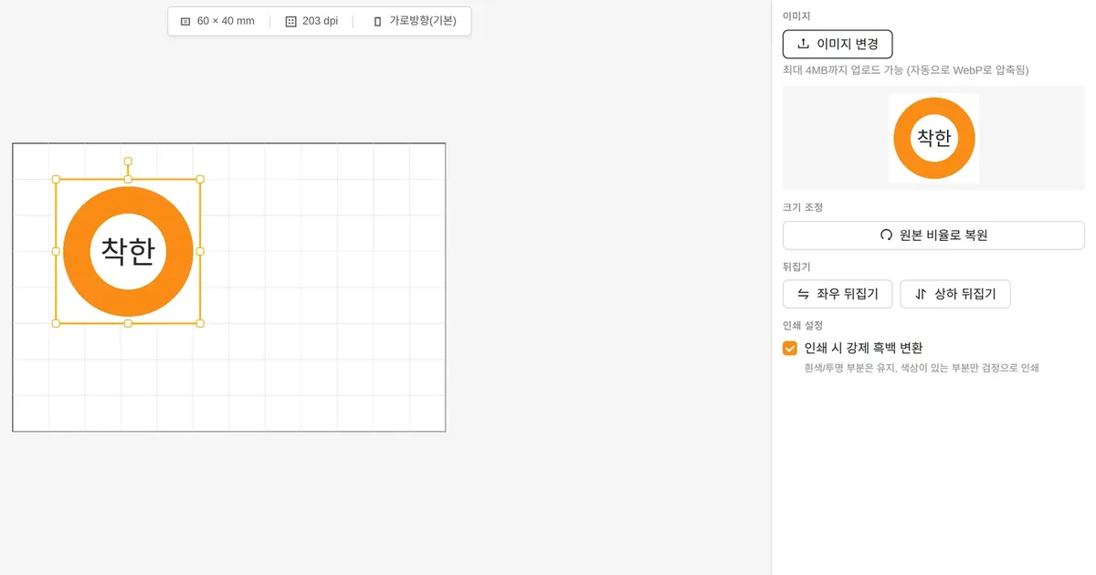
- Click Image in the tool panel on the left to place an empty frame. The frame size is the smallest of 50% of the label width, 50% of its height, or 30mm, so on a 60×40mm label it's a 20mm square.
- Choose the file with the upload button in the Properties panel on the right. Dragging onto the canvas and pasting aren't accepted, so this one button is the way in.
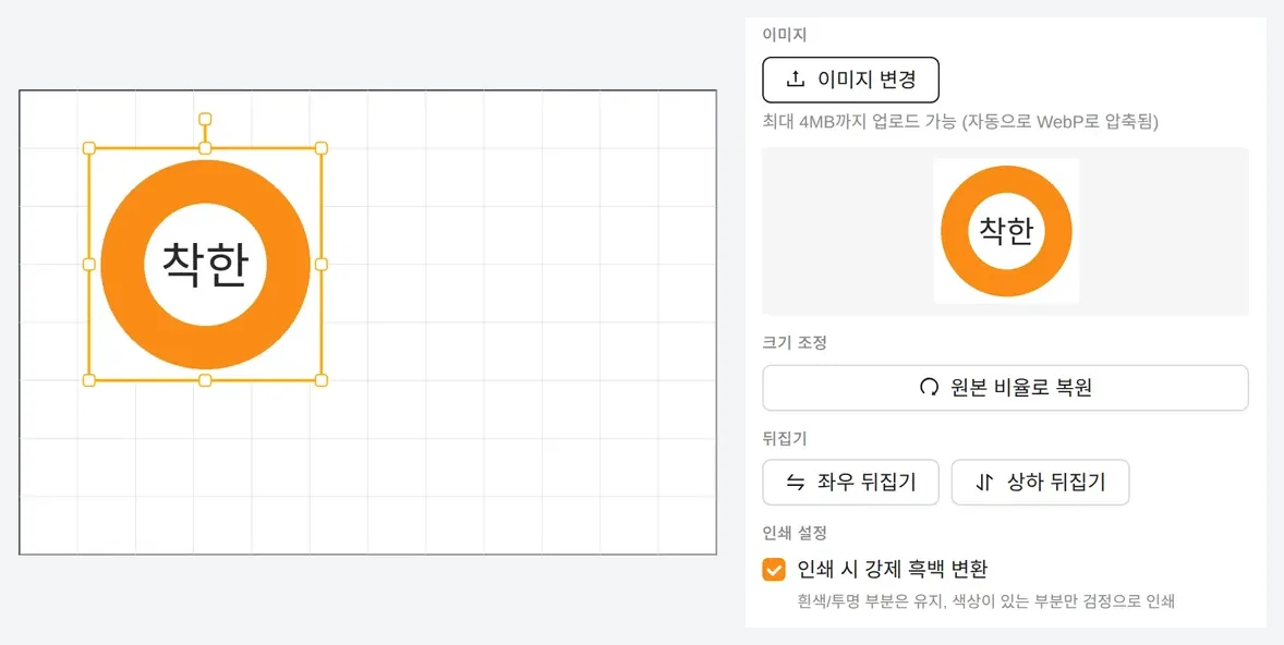
- When the file comes in, the frame's width in mm stays and only its height changes to match the image's proportions. Stretching it afterward with a corner handle releases the proportions, so if it gets distorted, click Restore aspect ratio.
- Check Force monochrome when printing in the image's Printer settings section. Newly added images start with it on, but images in .glb files saved earlier may open with it off.
Once an image is in, the same button switches to changing the image, swapping only the logo while keeping the frame's position and width in mm. An explanation with screenshots is in the Images · Icons/marks chapter of the user guide.
Accepted file formats and the 4MB and 2000-pixel limits
The upload button accepts 6 formats: JPEG, PNG, GIF, BMP, WebP and SVG. If the original is over 4MB, it's rejected with a message that the file is too large, and files that pass are recompressed to WebP at 85% quality and stored inside the .glb file. Images wider or taller than 2000 pixels are shrunk to fit within 2000 pixels, keeping their proportions.
SVG also becomes a pixel image at this stage, with its size following the width and height in pixels written in the SVG file. An SVG saved at 64×64 pixels for icon use prints with stepped edges when enlarged to 30mm, so if the only original you have is SVG, export a PNG with at least the pixel count in the table below and upload that.
Pixels needed by logo width
The designer draws each label as an image at the same resolution as the printer's dots and sends that. 203dpi is about 8 dots per mm and 300dpi about 11.8, so if the logo image has fewer horizontal pixels than the dot counts below, each pixel stretches over several dots and the edges blur.
| Logo width on the label | Dots at 203dpi | Dots at 300dpi | Image width to prepare |
|---|---|---|---|
| 15mm | 120 | 178 | 360 pixels or more |
| 20mm | 160 | 237 | 480 pixels or more |
| 30mm | 240 | 355 | 720 pixels or more |
| 50mm | 400 | 591 | 1,200 pixels or more |
The right column is about twice the 300dpi dot count. Monochrome conversion happens first at the original resolution, and the image is then reduced to label size, so with plenty of original pixels, 2–3 pixels merge into one dot and curved edges come out smooth. The 2000-pixel cap is about 169mm wide at 300dpi, more than enough for 4-inch desktop labels.
The 2 stages that turn a color logo black and white
Stage 1 happens separately for each image with Force monochrome when printing turned on. Colors are converted to brightness 0–255 and lightly blurred over a 3×3 area to remove specks, and then a threshold is set between the dark and light groups in that image's brightness distribution (Otsu's method). Pixels at or below the threshold become black, those above it become white, and pixels more than 50% transparent stay transparent and take on the paper's color.
Stage 2 applies to the whole label. In default printing sent directly to ZPL, TSPL and EZPL printers, every dot of the label image is cut once more at a brightness of 128, and images with Force monochrome when printing turned off get only this 128 threshold, so light colors drop out entirely. How each color falls against the 128 threshold is in the black-and-white contrast table of Small label design basics.
- A logo whose brightness falls clearly into 2 groups, like navy text on a white background, gets its threshold between them and prints exactly like the original.
- In a logo with 3 brightness levels, such as navy text, a pale yellow area and a white background, whether the pale yellow goes black or white depends on the area ratio. Before the yellow area disappears or turns into a black blob, revise the original to a one-color version and upload it.
- In a PNG with a transparent background, the transparent parts come out white, so there's no need to lay a separate white rectangle underneath.
Photos, gradients and dithering
The direct printing path has no dithering step that imitates gray with dot density, so product photos and gradient logos are cut at a single threshold, with light areas blowing out to white and dark areas clumping into solid black. Even a black-and-white image dithered in advance in another tool gets its 1–2-pixel dot pattern smeared by the 85% WebP lossy compression at upload and the 3×3 blur, so the result is uneven. The standard for label logos is a one-color version with only lines and solid areas; if you really need a photo, make it as large as the label allows and compare one print with Force monochrome when printing on and one with it off.
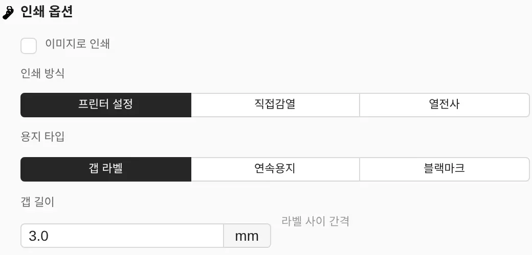
If you check Print as image in Printer settings, the Windows printer driver converts the image to dots, and if driver dithering is on, gray comes out as a dot pattern. The same setting also mixes dot patterns into the edges of barcode bars and lowers readability, so as the How to set dithering window in the Print window describes, set the dithering option to Clipart for Zebra drivers and to None (N) for other drivers. If a logo and a barcode share a label, fix the logo original to one color instead of turning on driver dithering.
Thin lines and narrow white gaps in direct thermal and thermal transfer
In both direct thermal and thermal transfer, one heating element on the head makes one dot, so the number of dots the thinnest line in the logo spans decides the result. A 0.1mm line is 0.8 dots at 203dpi, so depending on its position it prints as 1 dot or vanishes, while a 0.25mm line stays 2 dots wide. At 300dpi the same 0.1mm is 1.2 dots, but for labels where the logo is shrunk to 15mm or less, it's safer to thicken the thinnest line in the original to 0.25mm or more.
In a reversed logo with white text knocked out of a black area, the white gaps disappear first. Raising the density makes black dots spread sideways and fill white gaps 1–2 dots wide first, so print one label with a reversed logo at the default density (ZPL 21, TSPL 11, EZPL 13) and check that the white text survives. How to set density differently for direct thermal labels and ribbon labels continues in designer print method settings.
Direct thermal roll labels print directly without a ribbon, and for products exposed to moisture or rubbing, print YUPO labels by thermal transfer with a wax/resin ribbon. Both go through the same 2-stage monochrome conversion above, so you only need to prepare the logo file once.
Built-in marks and logos on QR codes
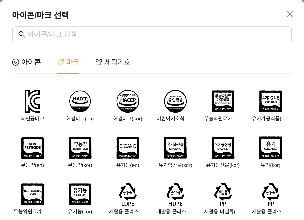
32 marks, including KC, HACCP and organic certification marks and recycling and disposal marks, are on the Marks tab of Icons/marks in the tool panel. Marks are drawn from their SVG originals directly at the resolution of the label being printed, without the WebP compression or 2000-pixel reduction that uploads go through. A short answer is in the adding a logo FAQ entry.
Overlaying a logo on the center of a QR code means the covered cells must be made up by the error correction margin, so decide on level H (30% recovery) and the code size together. Work out how much the code grows with a logo using the error correction table in QR code label size.